Print Production – InDesign Technique

In print production, I have made a packaging for perfume using the Adobe software ‘InDesign’. In this blog post I shall illustrate exactly how I designed my package, by showing you what tools I used and how to use them.

Screen shot 2012-12-18 at 10.20.01When you open up InDesign, this box, shown above in a screenshot will appear. To create a new document you would go to the bold title ‘Create New’ and select ‘document’.

Screen shot 2012-12-18 at 10.24.23Once you have done this, another box will pop up which looks like this. In this box, you can change the actual size of your page. Here it is set to ‘A4’, but you could select other presets such as A3, A5, B5, or state whether it’s a letter, as an alternative you could set a custom page size instead.
In the same box, you can also alter the orientation of your page, choosing whether the document will be landscape or portrait. Here, I have set it to portrait.
At the bottom of this box, you can set the margin size so you have your design inside of your margins. You can change the margin size by clicking the arrows next to the numbers, or alternatively manually typing in the number measurements you’d like the size of your margins to be. If you want the margin size to be equal on every side of your document, once you have set one of the margins you can click the chain box which is in the middle of the margin numbers, and this will set all margin sizes the same.

Screen shot 2012-12-18 at 10.32.52

To include text into your document, you will use the text tool. This is the ‘T’ symbol on the side bar menu on InDesign, shown in a screenshot on the left. Once you have clicked this tool, drag a text box onto your document where you want it and what size, though this is not important as you can change the size and move the box around later on. Once you have dragged a text box onto the document, you can start typing.
Screen shot 2012-12-18 at 10.35.29

To change the size of your text, highlight your text and go to the top menu to the drop down bar which looks like so. (screenshot on left). You can press the up and down arrows the change the number size of the text, or alternatively type in the number for the size which you want your text to be.

Screen shot 2012-12-18 at 10.39.33

Also, to change the colour of your text you will again highlight your text, then go to the top menu in InDesign, and press the large bold ‘T’ symbol, which will then bring up a scroll box, shown in the screenshot on the left. You can select a preset colour, as black, blue, pink, yellow, red and green; or go to the colour swatch which is at the bottom of the same box. In the colour swatch, you can pick any colour you like.

Screen shot 2012-12-18 at 10.42.54

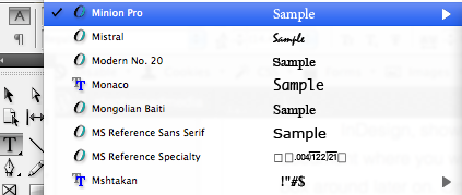
To change the font style of your text, you would again highlight the text and go to the top menu bar of InDesign, and select the ‘A’ which will then bring down a scroll down list of various fonts which you can pick from. Here, I have chosen Minion Pro, which is the font highlighted. In the same area, you can choose whether the text will be bold, or italic.

To drop in a template into InDesign, you will need to save the template onto your desktop first. Once the template has been saved, drag and drop the template from the desktop or open up the template from ‘File’.

Screen shot 2012-12-18 at 11.01.51

To create new layers in InDesign, go to the menu bar which is located on the right hand side of InDesign and select ‘Layers’. Once you have done this step, a box will pop up and there will be a smaller box at the bottom of this box, click this and a new layer will be created.

Screen shot 2012-12-18 at 11.04.14

To use the rectangle framing tool, go to the left hand menu on the right side of InDesign, and select the tool which looks like so. Select this and then click and drag on the document where you want it.
To position the box, you would hover your desktop arrow over the box and a different arrow will come up. Click and drag the box to position the box somewhere else on your page.
To resize the box, you would again hover over the rectangle box and click it. Once you have clicked it a box will appear around the rectangle, with tools covering it. To resize it click and drag the box and it will make it larger or smaller.
To change the colour of the rectangle box, click/highlight the box, then go the top menu bar and there will be an option to change the colour. Click this and select the colours in the drop down menu.

Screen shot 2012-12-18 at 11.10.29

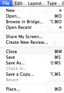
To drop in images to your InDesign document, go to ‘File’ which is located at the top left hand side of your screen, then a drop down menu will appear. Go down to ‘Place’ or alternatively press command and ‘D’.
Once you have clicked ‘place’ another box will come up, from where you can select your image which you want to place on your document.

Print Production – Self Assesment

I have designed a woman’s perfume packaging using the software InDesign. Whilst designing my packaging for the product, I took into consideration exactly what my target market wanted, which was females aged 16-25, from this I mind mapped what would appeal to this age range which is how I came up with my design.

On my packaging, the thing that works really well is the colours that I have used, as the colours appeal to my target market, and the text, borders and images have the same tone of pastel colours. Also, the font style which I used works well as it is girly and fits in with the floral images which I placed either side of my packaging box.
Although there are good points about my packaging, there are certain aspects of it which could be improved such as the flower logo. To make this element better I would perhaps use Photoshop to correct the outline of the flower so it looks neater.
From completing this particular assignment, I have learned various new skills on how exactly to use the Adobe software ‘InDesign’, for instance, how to place an image onto my design, and changing the text to how I wanted it. Also, I have learnt how to research into what specific target markets want by using secondary research on the internet looking at other already existing products on the market, looking into unique selling points and products appearance.For creating this product, I took inspiration from women’s scents already on the market, looking at fragrances by Cath Kidston and Marc Jacobs. Looking at packaging helped me a lot, as I took ideas from existing products and creatively changed them into my own ideas by using different colours and playing around with various text styes.

Once I had designed my packaging, I asked some of my peers to evaluate my design. One comment I recieved regarding my package was that it was “Very pretty, it definitely appeals to me, I would buy it if I saw it in a shop.” This particular comment was from a female aged 17, so I have achieved designing for my target market.
Another comment on my package was “It is well designed, although the colour pink is slightly overpowering.”  From this feedback, to improve my design I would next time use a more diverse range of colours, or use my chosen colour scheme more equally.

Looking at my finished design, in my opinion I think that my chosen text style and images work well together as they both give off a girly appearance, with the floral images and italic text. As it is girly, it stereotypically works for my particular target market.
If I was to redo this assignment, I would make slight changes to my design to improve it by using my colour scheme equally so one particular colour isn’t overwhelming, and the image colours match the text colours exactly. I think this would then appeal more if it was to really be placed in a shop.

I chose my colour scheme of pastel blues, pinks and greens because these colours appeal to the target audience of females aged 16-25. Also, I used a girly floral design and placed images of flowers on my package because girls my own age are stereotypically attracted to things with flowers and of the colour pink. I found this out while researching into already existing perfume packages, looking at how other designers have created their package and what girls generally are into.
My finished package meets my target markets needs because of the overall design of the package, the appeal of it, and the colours and images which I chose to use. I think that if my packaging were to be placed in a shop and was sold, 16-25 year old girls would definitely find it eye catching and would want to buy the product simply because of the packaging design.

Packaging Research

For my print production class, I shall be designing and creating a packaging box for a beauty product, such as perfume. I shall be researching and discussing various aspects of four different perfume bottles and packaging to give me some inspiration for what particular designs I shall be including in my own packaging.

Marc Jacobs – Lola

The first perfume packaging I shall be looking at is Marc Jacobs, ‘Lola’. I have chosen this particular scent package because I like the simplicity of the design, it’s very minimalistic using only three main colours, giving it a sophisticated look, even with the floral design, therefore appealing to the target market of middle to upper class 25-40 year old feminine females.
The embossed metallic gold lettering and bold font makes the brand and the name of the scent really stand out against the black background, defining straight away of whom the designer is and what product the consumer is purchasing.

Vivienne Westwood – Naughty Alice

The second perfume packaging I have decided to look into is Vivienne Westwood’s ‘Naughty Alice’. The reason I chose this package to look at was it’s simple use of colours, very eye catching yet so elegant at the same time. There are only three colours present on the design of the package, a blue for the background, a metallic gold for the bordering elegant design and also the designers name, and a seductive striking red to make an impact of the perfumes name.
Because of the elegant design, I would say that the target market of this particular perfume would be 20-30 year old females, although a younger generation could also find this scents packaging appealing as it is fairly eye catching, so adolescents may be attracted to the perfume also.

Moschino – Pink Bouquet

The third perfume packaging which I’m going to look into is Moschino’s ‘Pink Bouquet’ perfume. The target market for this particular scent, judging by the packaging, would be 13-20 year old females. I think this is the general target market because of the colours used, pink and metallic silver, and the styling of the package with diamantes and bold fonts, also coloured pink.
In my opinion, the use of colouring (pinks, white and silver), the styling of the font itself, and also the glossy finish of the actual package would be really eye catching for a young adolescent as this would stereotypically be what they are into, style wise.

Christina Aguilera – Eau de Parfum

The fourth and final perfume packaging I am going to analyse is a scent by a famous singer, Christina Aguilera. There are two main colours being used, which are light pink and black. The styling of the package gives off a very elegant and sophisticated look, with the font and the embroided lace design across the package.
I think that, considering the designer of this perfume is a celebrity, the target market is aimed at fairly young girls, aged perhaps 13-18. The reason for this being that young girls idolise celebrites such as Aguilera therefore would be likely to buy this product. But the packaging suggests it being aimed at middle-aged women, as it looks sophisticated with the style and the etched design on the front of the package.

Printing Methods

Firstly, for our assignment ‘Looking Good, Smelling Nice’ we have researched various printing methods which would be used for printing on packages, posters and so on. We were put into groups for a task of a quiz where we researched various different main points and facts on each different printing method….

Offset Litho Printing or Lithography;
  This particular printing process usually uses four ink colours, which are cyan, magenta, yellow and black (CYMK). Offset litho is based on the principle that ink and water do not mix together, therefore the ink will stay in the certain places where there is no water present, which will then be transferred onto a rubber blanket before finally ending up on the paper which will be printed on.
The printing plates of which the ink and water will be placed on is often aluminium metal, although the metal zinc could also possibly be used as well. Offset litho usually prints onto paper, and paper is made from wood pulp, (essentially fibre from wood).
Before any of this printing process can take place, cornflour is sprinkled onto each individual piece of paper being used, to ensure none of them will stick together whilst printing on them, and nor after they have been printed.
While sheet-fed offset litho printing is printed by individual sheets of paper being fed through the machinery, web offset litho printing is less time consuming as it is printed on a continuous roll of paper, using two cylinders. Web offset litho can generally print 20,000 sheets per hour, which is inevitably a handy process to use whilst printing products such as newspapers, magazines, and even books.

Flexography;
The printing method named flexography is usually used for product packaging, like food packaging. Flexography can be printed on non-absorbent surfaces, such as types of plastic and also paper. The plates which are used for the flexography printing process are made out of a rubber compound.
Flexography is rather similar and could be compared to ‘potato printing’ because the ink used is put onto the surface of the rubber. The flexography plate looks as though the design has actually been etched onto the plate, as the design needs to stand out from the background.
Etched means that the surface stands out from the background. The desired design is engraved onto the material used, which will then print off the design onto the product.

Rotogravure;
Another printing process is Gravure, and is the most common printing process as people use something that has been printed using Gravure in everyday life; money banknotes. The printing plates used in the gravure printing process is a metal, more specifically diamond etched copper plate.
Gravure plates and flexography plates although carry similarities, are different as with gravure plates, the ink fills the design that is already etched into the plate, instead of on the surface. Also, they are thicker and not flexible.