Evaluation of Media Products

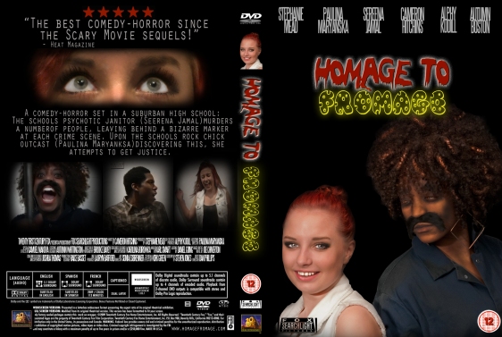
Steph_DVDcover

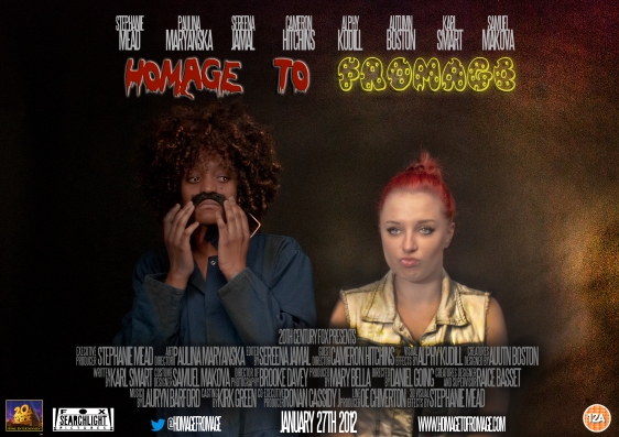
Steph_Film_Posterhttp://youtube/luveV0PFyKg

I have created three media products for a film that we titled “Homage to Fromage”. I have tried to make the three media products look the same so they are recognisable as selling the same film.
For my DVD cover I used Photoshop to design the actual front cover, spine and back cover. This included editing the models, manipulating specific fonts, and places other images such as logos on to it. I then used a software called InDesign to place the images together in a DVD cover format.
For my poster, I used Photoshop too. I made the background myself by using certain tools such as the dodge and burn tool, I manipulated the models slightly to fit their characters persona, and added in the logos and text.
To edit the film trailer, I used the software Final Cut Pro, and added in company logos (Paramount theme) and picture, such as the beginning green restricted screen and the films logo, and then added in text to indicate to the audience what is happening.

All of my three media products do meet my original intents, such as the DVD cover and poster fit the theme of horror, though there is the comedy aspect there by the models actions and also the font used for the logo.
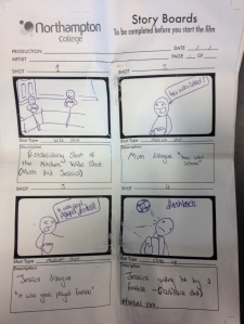
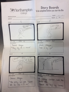
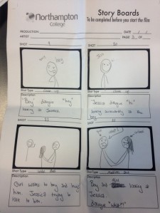
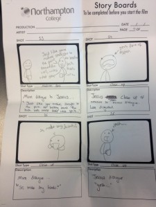
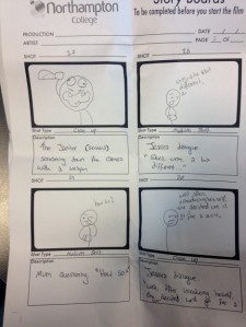
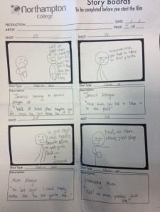
My film trailer is slightly different to what I had originally planned it to be, as our group originally proposed it to be back and forth dialogue with flashbacks, although when we had realised that this didn’t fit the film trailer structure, we had to shoot more and change the plan for the trailer.

In editing my film trailer, some problems occurred. For instance, once I had fully edited the trailer I realised that it didn’t meet the criteria of a film trailer so my group had to shoot more shots in order for the film trailers to fit the structure of general trailers.
Also, in my DVD cover, I orignally used the wrong measurements for the front cover, meaning it didn’t actually fit in the InDesign template once I had placed it in. This meant going back to Photoshop and resizing, then adjusting some of the image placements on the cover.
On my poster, I couldn’t get the contrast and brightness quite right on the characters, so they looked too dark and blended in with the background, or they stood out too much. I fixed this problem by adjusting the brightness on each model individually, and then editing the background further to fit it in with the horror aspect of the theme..

Personally, I think on my poster the strength of the general product would be how the characters were posing. As they are posed in a way that indicates what their characters persona is like, that could potentially intrigue the target audience to watch it, as they could find this funny.With my DVD cover, I think the strength would be the back cover where the scene previews are, as they really stand out and are attention grabbing, and make you want to watch the film, as though they are scene previews, they don’t give that much away.
On my film trailer, I think that the main strength would be all of the actions shots that are included near the end. I think that the way I have cut and edited it fits in with the tense music that I used, though there is still that comedy aspect there from the action in the scenes.

Comparing my media products to other official existing media products, I can see that mine don’t look that professional. For instance, on my DVD cover and also poster, there is a lot of empty space that makes it look slightly dull and boring. Especially on the DVD cover where the background is just a plain black. I could have improved this by choosing an appropriate image to act as a background that fitted in with the theme, which would have made it a little more exciting.
With my film trailer, the cuts and transitions weren’t as smooth as they could have been. Also, the font I used for the text is slightly boring, and I could have chosen a better font in order for it to have fitted in with my theme of comedy-horror. This could have easily been improved by taking more time on choosing a font, and cutting the scenes better by zooming in on my timeline and cutting it to the exact moment necessary.

Comments I received from peers –

Autumn – DVD – The background is a bit plain, I feel that that could something else in the background. I like how you captured scenes from your film for the images on the back of the cover.
Poster – The placing of everything is very even, not odd at all. I like the use of the brushes in the background, Also like the fonts used for the title, it goes well with the film. Very good editing.
Trailer – I like how the you have edited it as two people speaking first. The music sounds good with the trailer.

Cameron – DVD – Could be more interesting by adding something to the background, looks too plain and boring. The scenes on the back cover add interest, and the contrast is good.
Poster – I like how one character is in the dark and the other is in the light, fits with the characters. The font used is good, stands out well.
Trailer – The music fits in with the theme of the film and looks good on some shots. The action shots look good and exciting.

Tyraz – DVD – could have edited the people on the DVD cover better as they don’t look real. Should look more professional. The front is a bit boring but the back cover looks interesting.
Poster – I like the fonts that were used for the title of the film, it looks good. Also the way you edited the people looks better than the DVD.
Trailer – The film trailer is good the way it has been edited as you see the comedy and horror parts of it. I like how the music is quiet at parts then is loud on the action scenes.
Media Analysis – Iron Man Trailer Screen Recording and Script

Link to video of screen recording of film trailer analysis – http://www.youtube.com/watch?v=mkaWVKD7UJE&feature=youtu.be

Iron Man Trailer – Script

The Iron Man trailer opens with a quick medium shot of a modern fast car pulling up, with the next shot being of a man dressed formally in a suit and bow tie, both signs suggesting that this character has a lot of money and is important. Also stereotypically, the car would appeal to the target audience of the film, being heterosexual males aged 15-30.

Next is a medium shot panning to follow this character, with journalists and news reporters, attempting to talk to him. The next shot is of the character being interviewed by a lady, with the characters posture and dialogue making him seem big headed, which would intrigue viewers.
These shots suggest to the viewing audience that he is an important famous person, and a vital character in the storyline.

The Paramount and Marvel logos are then shown to let the audience know who made the film, giving some indication of what the storyline is, as it comes from a comic book company. Also, the logos are easily recognisable to a mass audience, which would entice audiences of other films by these companies to watch the film.

Next is a establishing shot, to set the current location. From this shot you can clearly tell that he is in a different country from previously, as he is getting off of an aeroplane. There are also a number of men standing to attention, all dressed in military uniforms. This is a sign that suggests there will be action, as the genre of the film is action. If there was no action in the film following this sign, the audience would get very confused and be mislead.

Then, the main character is focused on using a wide shot to show the remote location. Following this, there is a medium shot of three missiles. This suggests that the film has a lot of action in, and the storyline surrounds a war. Again, this specific aspect of the film would appeal to the target audience, as stereotypically boys of the ages 15-30 are interested in action packed war films.

These few shots in the trailer demonstrate the traits of the character, and his likability factor.
After this, there is an explosion from a bomb just in front of the car they are in which you see from the characters point of view, using a POV shot. It then fades to black, and quick action shots are shown of the main character in fear with more explosions, each fading to black to add emphasis to the drama and action.

There is now an extreme close up, focusing on the main character eyes to show his emotion, indicating fear. This shot quickly zooms out and the audience can see that he is being held captive, which you can clearly tell from the men standing by him with guns as he is tied up, which would intrigue the target audience as to what will happen next.

Now you see the storyline opening up, as the main character is shown building the iron armor in quick multiple shots, all using a variety of shots such as close ups, medium shots and wide shots, and then it fades to black intermittently to illustrate the time period lapsing, indicating to the audience how long it took him to build it.

There are lots of quick action shots of the character in the iron suit fighting against the antagonists of the film, these shots establish the genre with the audience, being Action-Adventure/ Sci-fi, so the audience are aware of the genre.
From knowing that this is the genre of the film, the audience would expect to see lots of fast action included, they would anticipate adventurous story lines, and fantasy from the sci-fi aspect.
Also, as this movie has been given the certification of PG, the audience would not expect to see graphic violent scenes, although blood may be shown.
As the genre is action-adventure and sci-fi, I would say that the target audiences socio-economic status is C2DE because of the fanatasy aspect, and also the violent scenes wouldn’t appeal to someone of a higher class.

Next are some quick shots of the film, to indicate other points of the movie. You see a medium close up of a female smiling, then a very brief sexual scene. As this scene is brief, it still fits in with the guidelines of PG.

The narrative of this film trailer is point of view, although in the film it is an open narrative structure. The reason that the film trailer is a POV, opposing to the movie being open, is because they want to make the film trailer simple and easy for the viewing audience to understand. Therefore, the audience don’t have to work much out to understand what is going on in the film trailer, though in the actual movie they would. From presenting the film trailer in this way, the movie is more likely to get more viewers, as the storyline is clear.
Also, the movies narrative structure is open so they can make sequels.

Certification

The BBFC (British Board of Film Classifications) is an independent organisation established in 1912, which certifies the age limits on films released at the cinemas and DVD, and also some video games. This organisation is non-profitable, and run purely on the fees that they charge the film industry for classifying the films.

Some of the points in the movie that they would use as guidelines to classify the movies are;
Discrimination, drugs, horror, imitable behavior, language, nudity, sex, sexual violence, theme and violence.
The BBFC would use these specific points to judge what particular certification category the film should be in, for instance, if the film they were rating showed graphic scenes of violence, substance abuse (inimitable behavior) and sexual references throughout, the film certification would be an 18. Therefore, only people aged eighteen and over could watch this movie and view it at the cinema.

Our group has given our film trailer a rating of 12A. When a film has the certification of 12A, it means that anyone over the age of twelve years old could watch this movie, and people younger than 12 can watch it if they’re accompanied by an adult, which is what the A in 12A stands for.
For a film to be given the certification of 12A, the use of crude language must be kept to a minimum and infrequently used, no dwelling on any imitable behavior such as self-harming, drug abuse etc. Brief sexual references, and violent scenes, without being too graphic, and no overall dark general theme to the film.

Our film trailer is suitable for the 12A certification because whilst there are scenes of violence in the movie, they aren’t graphic therefore twelve-year olds will be fine watching it. Comparing our movie to another horror movie such as ‘The Grudge’ where the content of the movie would really scare a young minor, such as the scenes where the antagonist is coming to get the main character of the movie. This is similar to our movie, though our scenes of horror, gore and violence aren’t graphic at all, and are all shown for only brief periods of time, hence why the certificate is suitable and follows the guidelines for 12A, and isn’t a 15 age limit.

Our film doesn’t have any imitable behavior at all, whereas the film ‘Black Swan’ has scenes of the main character self-harming throughout the film, which could pass off as imitable behavior, which is why Black Swan got the certification of 15, and not 12A.

Although the genre of our film is comedy-horror, there are no actual scenes of extreme or graphic bloody horror in it, just mild references and brief scenes, hence why our film is certified as a 12A. Opposed to the film ‘127 hours’ which is rated a 15 because of the scene at approximately 70 minutes in, it shows the main character cutting off one of his limbs, inevitably showing graphic scenes of gore and blood. Graphic scenes of horror would normally be rated as an 18, but as that particular scene got put off as a surgical procedure, it was put down to a 15.

The film ‘Juno’ has the same certification as our film ‘Homage to Fromage’ which is a 12A. Comparing these two films, they are very different, although both fit into the same guidelines.
For instance, the film Juno has sex scenes in, but as they are very mild and brief, 12A is a suitable certification. Also, these scenes are seen as imitable behavior, as the theme of the film includes unprotected sex and pregnancy. Our film also has imitable behavior, and use of bad language though not too much.

Our film, though in the same genre, is totally opposite to the film The Exorcist, which is rated an 18 (an x at the time of release). Both films are horrors, though The Exorcist is much more graphic with their scenes of violence, gore and sexual references. For instance, our film has a relationship in it and also brief sexual references in, though it is not at all graphic if you were to compare it to the film The Exorcist, where the antagonist is shown very clearly masturbating with a crucifix. This particular scene is one of the reasons that it was rated an 18, so only people of the age 18 or over can view this film, so minors are not harmed or offended by the graphic footage.

Who is the Audience?

stephboyI have thought about the audience of my film through the film trailer I shall be filming, and stereotyped in order to think of a person who would typically watch the film “Homage to Fromage”.

Socio-economic status: C2DE – I would say that the film trailer would appeal to the lower class category of people because of the theme and genre of the movie. The genre is comedy-horror, therefore the storyline is easy to understand because of the lighthearted horror and ironic comedy, it’s not very witty or intellectually satisfying so stereotypically a higher class (ABC1) range of people wouldn’t enjoy it as what they look for in movies isn’t included.

Geodemographic Location: For this film, this would be British + American. This is because of the language, where the film is actually set, and also what the people who live in Britian and America would be interested in.
The humour aspect of the movie would interest British and Americans.

Age: The age range of the typical audience member would be around 15-25. This is because this age category are most interested in the film genre of comedy horror, where as an elderly woman for instance, wouldn’t be.
This is due to the themes shown throughout the film, for instance, joking around a murder.

Gender: A stereotypical audience member would be a male, because males are more interested in comedy horrors than females would be. The themes of violence would also interest males more so than females, also the theme of the comedy is more suitable to a males taste

Ethnicity: All ethnicities would watch this film, as it is would interest people, regardless of their ethnicity.

 Sexuality: Stereotypically, this movie would only interest heterosexual people. This is because of the theme of violence in, so a stereotypical alphamale would be interested in it.


Film Poster Analysis

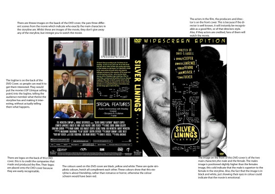
A film poster is generally used to advertise a film to promote it for when it is released in the cinemas. All film posters will have the title of the film clearly on the poster, the official release date, the director and main cast named in the credits. Also, an image that fits in with the genre (romance-comedy) and storyline of the film, and the ratings can be included to promote it further.

The main cast acting in the film are listed at the top of the poster in an eye-catching colour. The actors are very well known and popular; therefore will perhaps make fans of the actors watch it, hence why they included it in the promotional poster.

The way the two main characters have been captured illustrates what happens in the movie; half photographed, fitting together suggesting that there is love in the story.

The title ‘Silver Linings’ has been made into a logo, using a distinct font and colour scheme. They have made it into a logo so it is recognisable for the media product, as it is also a book.
Placed around the logo are significant quotes from the film, this would intrigue the target market (15-35) and interest them in the film. These have been put on in a font which looks like hand writing, which links in with the characters thoughts.

Roles Report

For the film trailer “An Homage to Fromage” I am working with four of my peers and we all have individual roles to do throughout the filming process.

Paulina is an actor, acting out the part of the main character called “Jessica Green”. She will have to dress accordingly to fit into her characters stereotype in order to successfully play out the character, and also, to help continuity, wear the same clothing all through filming. Paulina will have to work alongside the rest of the cast and also crew, and take orders from crew, the director specifically, and take into consideration other people playing the characters.

Cameron is our director, who will be initiating all of our filming and telling the cast and crew exactly what to do during the filming process. He will have to ensure that all of the shots that the camera man is filming are correct, using the right type of shot etc.

Alphy is our groups camera man, so he will be filming on the cameras the whole trailer. He shall ensure that all of the shots follow the composition and that the boom pole isn’t in shot. He will have to set up the tripod, and camera, and make sure that the memory card is in.

Sereena is another actor, playing out a main character, The Janitor. Sereena’s character is the one that brings the comedy to the film, so Sereena will have to play this role well without getting distracted or messing around in order for the filming to be successful.

In the filming process, I shall be acting for one particular corridor scene. This will require me to know exactly what the director wants me to do, and if any, what dialogue I will need to say.
I will also be on audio, holding the boom pole in the right position in order to sufficiently pick up enough audio, without picking up any ambient and foley. When filming audio outside, I shall put the wind shield cover onto the mic, so it won’t pick up any of the wind, effecting the sound quality.
I will also be checking up on the continuity. I will ensure that everyone wheres the same clothing each time we shoot, and all of the props required are on set.